

Gold Star Foods has been the leader in supporting K–12 operations since its inception. From leading supply systems to personalized customer service, Gold Star helps schools navigate the complexities of K-12 School Nutrition Programs.
In partnership with GoldStar Foods, Pulse Creative was tasked with re-introducing the company to it’s audience by creating brand awareness for GoldStar Foods through establishing an fresh, new, intuitive website that houses the company’s product offerings, services and online ordering platform to enhance the overall customer experience and retention.
Our work included an in-depth exploration of the brand, a Strategy, Key Messaging, Image and Composition and UI/UX Research & Design.
CLIENT
GoldStar Foods
YEAR
2019 - 2020
ROLE
Art Direction, UI Designer
AGENCY
Pulse Creative LLC


< Old Website
THE CHALLENGE
After reviewing GoldStar Foods’ brand marketing and extensive research into their competitors, we identified that the existing website lacked the following; consistent messaging and brand awareness, a digital ecosystem and there was no option to view various product offering without member login.

APPROACH & SOLUTION
Clear Messaging,
Better Hierarchy.
Through our strategy process, we provided guidance and clarity for the development of GoldStar Foods’ brand story. I combined beautiful photography, and a vibrant, compelling design to reflect that GoldStar was a leader in their industry.
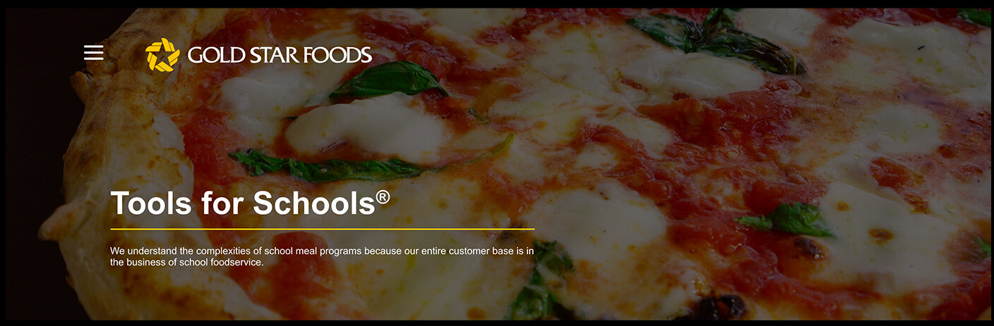
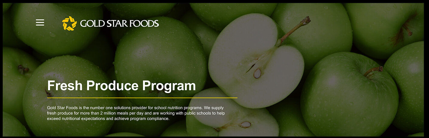
Parts of the process included reorganizing the content so that who they are, services and their impact in the industry were front and center. We also used strong visual headers to depict the fresh ingredients and food options for children. consistent messaging across the website and strict use of the brand colors (yellow and black) to create a more bright and friendly site that reflected their key consumer audience; schools, parents & children.
APPROACH & SOLUTION
Clear Messaging,
Better Hierarchy.
Through our strategy process, we provided guidance and clarity for the development of GoldStar Foods’ brand story. I combined beautiful photography, and a vibrant, compelling design to reflect that GoldStar was a leader in their industry.
Parts of the process included reorganizing the content so that who they are, services and their impact in the industry were front and center. We also used strong visual headers to depict the fresh ingredients and food options for children. consistent messaging across the website and strict use of the brand colors (yellow and black) to create a more bright and friendly site that reflected their key consumer audience; schools, parents & children.